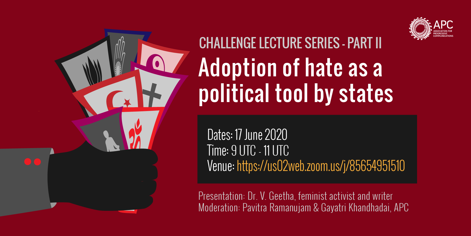
How to design your online event invitation
- Make your invitation short and visual. Include the visual identity of your organisation / event + title of the event + date + speaker + hashtag + any other relevant info. Add a link for further context and make sure there is an easy way to contact you for questions or suggestions. Describe the link target.
- Be honest about what you offer. Focus on your content and why it may be relevant or useful, invite people in an honest, not click-baity way.
- Avoid generic and spammy-sounding invitations such as “Are you going to miss this?” that will make you sound unoriginal and needy.
- Be mindful of language. Use simple language that welcomes people with different identities, gender expressions and diverse lived experiences.
- Make sure your invitation is available in higher resolution and size for persons who have vision of focus difficulties. Contrast letters, images and background. Use bold and bigger font types where appropriate.
Example: “APC invitations for Challenge lecture series”
https://www.apc.org/sites/default/files/styles/node_full-size/public/Hate_II.png?itok=a3LJKgeP


No comments to display
No comments to display